The Evolution of a Jewelry Catalog and Sundance Career

“One of the principles of Sundance is that art should be part of our daily lives not just something to be viewed from behind glass during an occasional trip to the museum.
We believe that by including art in every day living we enhance and enrich the simple pleasure of ordinary routines.”
– Robert Redford


Celebrating 20 Years of Jewelry Artists
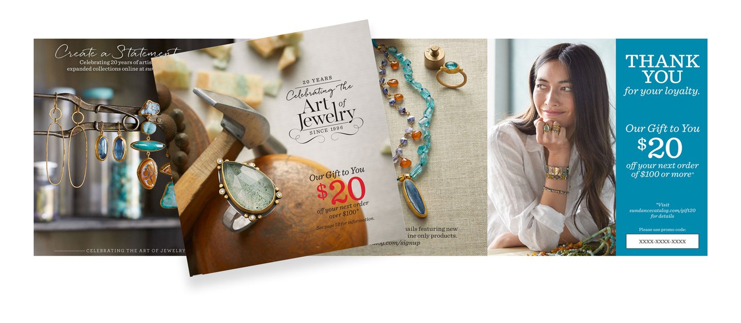
This Fall Jewelry catalog was a special edition commemorating Sundance's 20 years of selling and showcasing jewelry artists and their products. So, for the 2016 fall season, we chose backgrounds and propping to highlight their craft and celebrate these jewelry artists. The theme was "The [Jewelry] Artist".

Mood Board for Inspiration
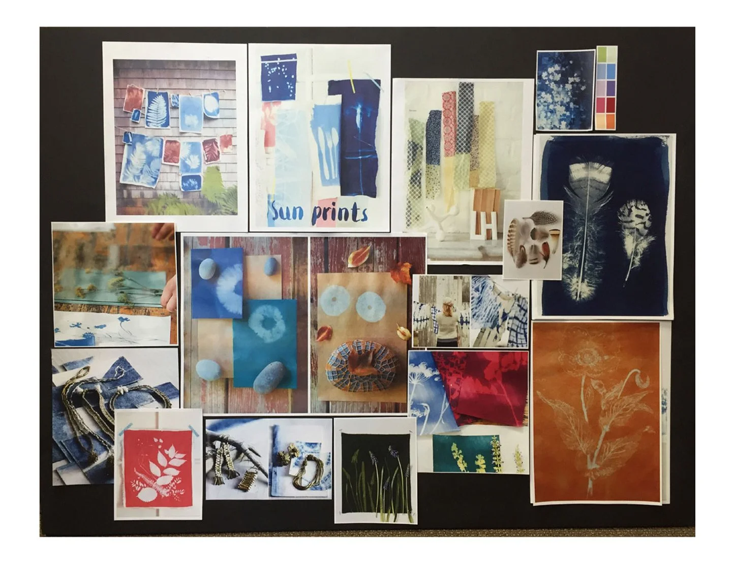
I created a mood board filled with tear sheets and inspiring images for the project in order to convey the theme to the executive decision makers.

Anniversary Icons/Logos
I designed anniversary icons to celebrate the 20-year milestone as well as explored special fonts for headlines throughout the "The Artist" project.

Refreshed Layouts
I created new layouts and design concepts to inspire our merchants to think outside the typical rules. We had a lot of rules. The great news, many of these new layouts worked very well and were used repeatedly in future projects.

Color Palette
A color palette was selected - think jewel tones, autumn leaves, well-worn wood - and the talented stylists started creating backgrounds.

Propping
The propping needed to feel brand appropriate, sophisticated and elegant with a slightly weathered, well-worn and well-loved rustic feel. The props could not overpower the small, sometimes dainty product. We sourced jewelry-making tools, gemstones, beads, leather, interesting shapes, containers & fabrics.

The Covers
The covers set the tone for the project and informs the season, the mood, the spirit and the collection. They are meant to intrigue and inspire the customer to open the catalog and start shopping.

Storytelling Through Photography
Each of Sundance Jewelry Catalog had a new story and theme. The covers needed to feel, and were, uniquely Sundance. The photography for this book was filled with lovely autumn color, beautiful texture and interesting shapes.

Still Life Jewelry Sets
Our goal was always to shoot 8-12 still life shots per day depending on the product(s). A 56-page catalog was generally shot in two weeks, including the on-figure photography. Like this one, some jewelry sets could get very complicated.

Finished "Spreads"
This is an example of a finished catalog spread. Two separate shots that needed to sit well together in color and styling and also play well with the remaining 54 or so pages.

On-Figure Studio Photography
The on-figure studio photography followed the still life photography. Sets, props and backgrounds were concepted to mirror the theme of the project. The hair and makeup stylist worked away while the sets were being put into place. There was also a prop stylist working with the crew to style the backgrounds and hand the model props to hold. The set changed for each shot, generally there were between five and eight different sets. We also shot web product details, cover options and editorial shots during the two to three day shoot. I edited the shots at the end of the day to narrow down to the 20 best out of 100s of shots.

Desktop Publishing and Review Process
On-figure and still life photographs and copy were placed into the layouts and circulated for proofing, reviewing and approval.

Concept to Final
Here are a few examples of how the theme and concepts transitioned to the final catalog pages. Concept on the left, final on the right.
![Introducing <br>Sundance Jewelry 2016 - <br>The [Jewelry] Artist](https://images.squarespace-cdn.com/content/v1/57e9db29b3db2be1c7d78ec3/1724182097944-VJXG8JQJXFC6EVVPRAOS/jewelrypresentation-30-copy.jpg)
Introducing
Sundance Jewelry 2016 -
The [Jewelry] Artist
”To us, Sundance is and always will be a dream…
What we offer in the form of art & culture,
spirit & service, is homegrown and available to all.”
– Robert Redford


Website Product Shots
Following the catalog shoot, we photographed each new product to show special details in an easy-to-shop fashion and introduced them on the website just as the catalog launched.

Website
Examples of sundancecatalog.com directory page and product pages.

Special Landing Pages to Celebrate the Artists
Each jewelry artist featured in the catalog was given a special profile landing page on the website.

Across the Board
I then translated the project across multiple channels and platforms - desktop to mobile: homepages, landing pages, emails. We created posts for social sites and ads. As well, we designed and created bind-in cards and in-store retail messaging.


Cast & Crew
The cast for this "The [Jewelry] Artist" Fall Catalog photoshoot was as follows:
On Staff:
Art director, catalog designer/production artist, studio manager, two photography set builders.
Freelance Staff:
Two freelance photo stylists, production assistant, still life photographer, still life photo technician, fashion photographer, fashion photo technician, model, hair & make up stylist, fashion stylist, prop stylist, stylist assistant.
A special thank you to the two amazing photo stylists: Jutta Gellersen and Elizabeth Shaver and master of jewelry photography, Shane Huntsman.
The rest of the cast of characters did a fabulous job as well.

To Everything There is a Season
The only constant is change and a lot has changed since the beginning of my career. It's hard to believe you can now shoot an entire catalog or even a movie with your iPhone (maybe not recommended, but it definitely can be done.)

Then and Now
Beginning with cutting and pasting words spit out by a Compugraphic typesetter to everything easily and conveniently designed and proofed right on the screen and on the fly - even from across the country; digital design and photography has definitely improved the process.

Below is a depiction of one year of Sundance jewelry book art direction and projects:
• Spring 1 Jewelry (Valentine's Day & Spring)
• Spring 2 Jewelry (Mother's Day)
• Summer Jewelry
• Fall Jewelry
• Holiday Jewelry

Valentine's Day
Spring 1 Jewelry - Valentine's Day and Beginning of Spring: The theme for this project was "Textured Clay". We purchased a few finished clay pieces but the stylists created and painted a lot of the pieces themselves.


Mother's Day
Spring 2 Jewelry - Mother's Day and Late Spring: The theme for this project was "Drawing on Florals". We used live florals to finish different objects that were sketched out in watercolor.


Summer
Summer Jewelry - Summer Season: The theme for this project was "Sun Prints". The stylists gathered different plants and objects and created beautiful fabrics using the cyanotype process.


Fall
Fall Jewelry - Fall Season: The theme for this project was "The [Jewelry] Artist". We borrowed well-used tools from jewelers and sourced beads, stones, gems, leather, glass jars, jewel-tone fabrics, metal and other interesting objects that reflected items from a jeweler's studio.


Holiday Jewelry & Gifts
Holiday Jewelry - The Holiday Gift Giving Season: The theme for this project was "All That Glitters". We used a lot of gold and gilded objects, ornaments, ribbons, velvet leaves and boxes and glittered objects. What we couldn't find in gold was painted gold or glittered in studio by the stylists.


So many shots, so few covers. Some shots made it as covers, others we felt should have been part of a "Lost Covers" coffee table book. They were so many beautiful shots and we used as many of them as much and everywhere we possibly could in the seasonal projects.


